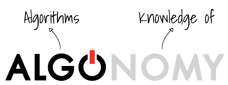
Algonomy means the “systematized knowledge of, and the domain of algorithms”. Just like today’s retail pioneers, we believe it’s time to do away with fragile rules, guess-work and static segments. It’s time you had the ability to act – in real-time. It’s time to be bold in digital transformation, creative in strategy and agile in decisions.
These are the underlying principles we have tried to incorporate in our identity. Our logo symbolizes power, boldness, creativity and actions. Algonomy is here to prepare you for constant change, to help business become algorithmic.
Algonomy is bold creative agile .
The Logo
Our logo is the combination of a simple and strong word mark with the icon (flare).
The flare represents the power and the ability to always be ready for change.
The brand takes on a standard visual expression, but it also adapts to the environment such as taking the colors of an important day or holiday, supporting a cause, celebrating an event or person. The full logo or icon (flare) can be used to achieve this dynamic visual expression.
Check out their applications and permissions. We would appreciate it if you could follow these guides to make sure it always looks its best.

Safe Area
The Safe Area ensures readability and impact of the logo, guaranteeing its visual integrity without competing with supporting texts or graphics.
This area should be considered as the minimum distance required, the ideal is to give even more space for the logo breathe.
The Safety Area is guaranteed by the height of the first O, without our icon.

The Flare
The flare (switch/icon) can be used in certain circumstances to obtain a dynamic visual expression. In situations where a more visual representation is required, always respecting its application following the values and purposes of Algonomy.
Its use can be applied to images where its application in a playful way, resembles the O of Algonomy, where it is originally applied, according to examples on the side. This usage is limited in its use but gives a unique brand signature.
The Switch can be used without the wordmark, but the wordmark should never be applied without the Flare.
If you are using the switch instead of the logo, the same safe area rules apply.
The security area is the width of the icon as illustrated (marked as × in the diagram).
Flare Variations
Applications and Permissions
Proportions
To preserve legibility, the logotype never appears smaller than the following sizes:
Digital

Don't step
Do not place our logo on the floor, where people will step on it or get it dirty.
Don't deform
Do not apply our logo in distorted formats, in colors other than those identified in the palette.
Don't damage
Our logo should not be applied that could degrade our brand, with values not associated with those of Algonomy.
Logo usage
Primary Versions
The black logo is used on light backgrounds and the white logo is used on dark colored backgrounds.


Mono Versions
If color is not an option for technical reasons, you are allowed to use the black or white logo options.

Photography background
The black or white logo is used on noisy background photography to ensure the logo is readable.

Typography
Our font family is modern, simple and universal – it guarantees the clarity of our communication. Beside you can check its universal application, however adjustments of body and size are allowed to maintain clear communication.

Graphic Elements
Circles and waves are part of Algonomy’s visual design but the elements do not limit us in themselves.
The purpose of its use is to give fluidity, agility and adaptability to our brand. The idea of fluidity can be presented in other ways as long as it is consistent with a specific style and use.
SemiCircle
The circle and semi-circle are drawn from the logo itself and can be used as visual elements.

#Colors
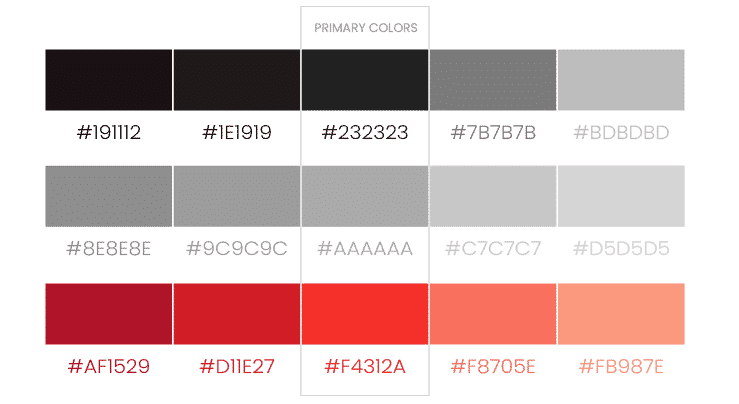
Black, for power and sophistication.
Red, for the passion and ambition.

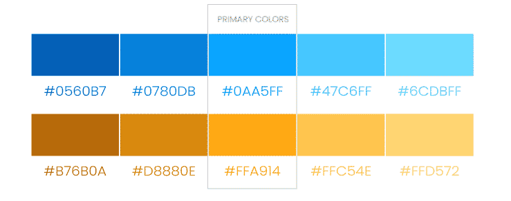
Blue, for intelligence and trust.
Orange, for creativity and warmth.

Communication
The primary colors are three – blue, orange, red – as well as black and white for the logo. The colors blue, orange and red are used in our communication in the graphic elements.
BLACK
GREY
RED
BLUE
ORANGE
Iconography
Buttons and CTA
are always in blue.
Icons
and its variations.

